 blog
Are White Plantation Shutters Still in Style in 2026?
Last Updated: 31 October 2026
Quick Summary
Yes, white plantation shutters are still in style in 2026, but the white that's in style has changed. Brilliant, blue-toned white now reads as a decade-old choice, while warm white and ivory sit at the centre of current interior design.
- Warm white and ivory blend with natural materials, wood tones and textured fabrics rather than fighting them.
- Slim, square, flat frames read as timeless; wide moulded or ornate architrave reads as dated.
- Concealed tilt rods and colour-matched hinges remove visual noise and read as current.
- You can refresh tired shutters by repainting brilliant white in a warm white or ivory.
- Ask for samples of both colours in the room's own light before deciding.
Table of Contents
- Are White Plantation Shutters Still in Style in 2026?
- The Most Popular Colour for Plantation Shutters in 2026
- White Plantation Shutters Pros and Cons
- Do White Shutters Actually Look Dated? Evidence and Context
- Plantation Shutters for Modern Interiors: Where White Still Works
- How to Update Dated Plantation Shutters Without Replacing Them
- Choosing the Right Shutter Colour and Style for Your Rooms
- Book a Free Home Consultation and Measure-Up
- Frequently Asked Questions
Are White Plantation Shutters Still in Style in 2026?
Short answer: yes, but the white that's in style has changed. Brilliant, blue-toned white now reads as a decade-old choice, while warm white and ivory sit at the centre of current interior design.
White plantation shutters are interior window coverings with adjustable louvres, fitted inside the window recess and finished in a white or near-white tone.
Below, we look at the 2026 colour trends, the pros and cons, and how to tell a timeless shutter from a dated one.
The Most Popular Colour for Plantation Shutters in 2026
Warm white and ivory are increasingly popular shutter colours in current interior design, with pure brilliant white suiting more clean, neutral schemes.
Interior colour trends have moved towards warmer palettes, and a stark white shutter can jar against them.
Warm White and Ivory: The Shift Away from Brilliant White
Brilliant white has a cool, slightly blue undertone. Against magnolia walls it looks crisp.
Warm white and ivory carry a hint of cream, blending with natural materials, wood tones and textured fabrics rather than fighting them.
Best for: period properties, living rooms, and any room with warm paint colours. Skip if: you want maximum light reflection in a dark hallway, where a brighter white still helps.
White Plantation Shutters Pros and Cons
White shutters are versatile and hard-wearing, but not the right pick for every room. For an honest overall assessment, see are plantation shutters worth it.
Pros:
- Reflect light and keep small rooms feeling open
- Suit almost any interior style, from period to modern
- Hide dust and marks less obviously than dark finishes
Cons:
- Brilliant white can look cold against warm palettes
- Show dirt and finger marks more than mid-tones
- Can feel stark in north-facing rooms with little natural light
Do White Shutters Actually Look Dated? Evidence and Context
White shutters look dated only when the tone is wrong or the style is fussy. To see how they compare with other options, read our interior window coverings guide.
The dated look comes from three things:
- Blue-toned brilliant white against warm walls
- Heavy, ornate frames that clash with clean modern lines
- Poor fit, with visible gaps or uneven louvres
That list is a starting point, not a diagnosis. Below is the detail that separates a shutter that looks current from one that looks like it was specified a decade ago.
Dated versus timeless: worked examples
| Detail | What reads as dated | What reads as timeless | Why it matters |
|---|---|---|---|
| White tone | Brilliant, blue-toned white against greige or clay walls | Warm white or ivory that picks up the wall undertone | A cool white against a warm wall creates a hard edge the eye reads as "old" |
| Frame width | Wide, moulded or ornate architrave | Slim, square, flat frame | Slim frames let the window opening do the work; heavy frames compete with period cornices and modern lines alike |
| Louvre size | Narrow 47 mm louvres on large windows | 63 mm or 89 mm louvres scaled to the window | Undersized louvres look busy and fussy on tall sash or bay windows |
| Tilt mechanism | Exposed metal rods and visible hinges | Concealed tilt rod or a centred rod in the same finish | Visible hardware is the single most common giveaway of an older installation |
| Fit | Gaps at the reveal, uneven louvre spacing | Frame scribed to the recess, louvres sitting level | Poor fit makes even a good colour look like a cheap job |
| Surroundings | Shutter as the only strong element in a bare room | Shutter layered with curtains, a blind or soft furnishings | A bare brilliant-white shutter in an otherwise empty room reads as stark; the same shutter with a linen curtain reads as intentional |
The design principles behind the judgment
Three principles explain almost every "dated" verdict, and none of them is about white itself.
1. Undertone match. A white shutter should share an undertone with the wall it sits against.
2. Scale. Louvre size and frame width should be proportional to the window.
3. Restraint in hardware. Concealed tilt rods, colour-matched hinges and a simple handle read as current because they remove visual noise.
When white shutters genuinely do look dated
There are honest cases where the answer is yes:
- A full house of brilliant white shutters fitted in one go, with matching brilliant white architrave, in a period property with warm-toned walls. The uniformity dates it, not the colour alone.
- Shutters fitted over a bay window without scribing to the curve, leaving visible filler or gaps. The fit failure reads as an old installation.
- Shutters paired with heavy swag curtains and valances from an earlier decorating era. The shutter is fine; the surrounding scheme is not.
In each case the fix is usually tone, hardware or surrounding scheme, not replacement. White shutters date at the detail level, and details are cheaper to change than shutters.
Plantation Shutters for Modern Interiors: Where White Still Works
White shutters work best in modern interiors when the white is soft and the frame is slim, blending into the architecture rather than shouting about itself.
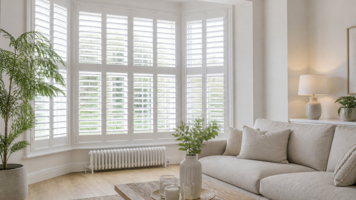
Pair white shutters with sheer curtains for a layered look, or leave them bare for a sharper, minimal finish. Both approaches suit contemporary rooms. For styling ideas, see our guide on how to style plantation shutters with curtains.
How to Update Dated Plantation Shutters Without Replacing Them
You can refresh tired shutters without buying new ones. Cleaning, repainting and adjusting the hardware often solves the problem.
Start with a proper clean. Grease and dust build-up dulls the finish and makes white look grey. Our step-by-step cleaning guide covers the full process.
Then consider these fixes:
- Repaint brilliant white in a warm white or ivory
- Replace worn tilt rods and hinges
- Adjust louvre tension so they sit evenly
Watch out: painting over chipped or greasy louvres traps dirt under the new coat, and it will flake within months.
Choosing the Right Shutter Colour and Style for Your Rooms
Match the shutter colour to the room's light and palette, not to a trend. North-facing rooms need warmth; south-facing rooms can carry cooler tones (Guiding light). Colour is only one of four decisions, and the room-by-room choice is easier when you compare white against the alternatives on the criteria that actually differ.
White versus the alternatives: a criteria comparison
The table below compares the main options on the factors that change how a room feels and how much upkeep it needs. It is deliberately balanced, none of these is universally better.
| Option | Appearance | Versatility across rooms | Light control | Upkeep | Best suited to |
|---|---|---|---|---|---|
| Brilliant white shutters | Crisp, high-contrast, reflective | Good in modern and new-build schemes; can clash with warm palettes | Excellent with closed louvres | Shows marks and dust readily; touch-up painting straightforward | Hallways, new-builds, rentals, cool-toned rooms |
| Warm white or ivory shutters | Soft, blended, low-contrast | Very good, sits with warm neutrals, wood and texture | Excellent | Hides marks better than brilliant white | Living rooms, period properties, warm palettes |
| Wood-tone shutters | Warm, natural, furniture-like | Good with traditional and rustic schemes; can dominate small rooms | Excellent | Less tolerant of moisture; finish can be harder to repair invisibly | Studies, dining rooms, rooms with exposed timber |
| Coloured shutters (sage, grey, navy) | Statement, design-led | Narrower, works when the colour is repeated elsewhere | Excellent | Marks show less on mid-tones; repainting a colour match is harder | Bedrooms, feature rooms, schemes built around a palette |
| Shutters plus curtains | Layered, softer, more traditional | Very good, curtains add fabric and colour flexibility | Best of the options, especially with blackout curtains | Two surfaces to clean; curtains need laundering | Bedrooms, living rooms, period properties |
| Blinds (venetian, roller, roman) | Neater, lower-profile | Good, but less architectural presence | Good; roller and roman offer less adjustable light than louvres | Roller and roman fabrics can fade; venetians collect dust on slats | Kitchens, bathrooms, rooms where shutters would feel heavy |
The practical point: white shutters win on light control and architectural fit, but they are not the only sensible choice. If your priority is softness and layering, shutters plus curtains beats shutters alone.
Room-by-room guidance
Use the table below as a starting point, then adjust for the light the room actually gets.
| Room | Best colour | Why | Watch out for |
|---|---|---|---|
| Living room | Warm white or ivory | Blends with warm palettes and soft furnishings | Brilliant white against a warm scheme reads cold |
| Bedroom | Ivory with blackout option, or shutters plus blackout curtains | Softer tone; curtains give the light control louvres alone cannot | Louvre gaps let in early light, plan for a blackout layer |
| Kitchen | Warm white | Hides marks better than brilliant white; wipes clean | Grease film dulls any finish, clean louvres regularly |
| Bathroom | Warm white | Handles moisture; easy to wipe | Check the finish is specified for damp rooms |
| Hallway | Brilliant white | Reflects limited light | Marks show quickly in high-traffic areas |
| North-facing room | Warm white or ivory | Compensates for cool, flat light | Brilliant white can feel stark with little daylight |
| South-facing room | Brilliant white or warm white | Can carry cooler tones without feeling cold | Strong light shows dust and smears |
Period properties and British window types
Broad trend advice rarely accounts for the windows British readers actually have. Three points are worth knowing before you specify.
- Sash windows. Shutters on sash windows need to be fitted inside the reveal without interfering with the sash cords or the parting bead. A slim frame and 63 mm louvres usually suit the proportions better than 47 mm.
- Bay windows. Bays need each panel scribed to the angle of the reveal. A template-based fit will leave gaps at the returns, which is the most common reason bay shutters look dated.
- Period features. In a property with cornices, picture rails or original architrave, a slim flat frame lets the architecture lead. A wide moulded frame competes with it and is the detail most likely to make a good shutter look wrong for the house.
Style variations worth knowing
Colour is only one variable. The style choices below change the look as much as the finish:
- Full-height versus café-style. Full-height suits tall rooms and gives maximum light control; café-style (covering the lower half) suits street-facing ground floors and kitchens.
- Tier-on-tier. Separate top and bottom sections let you close the lower louvres for privacy while leaving the top open for light, useful in living rooms and bedrooms.
- Louvre size. 47 mm for small windows and bathrooms; 63 mm for most living spaces; 89 mm for large windows and bay fronts.
For the full picture on materials, finishes and styles, read our interior shutters buyer's guide. We make every set 100% made-to-measure.
Book a Free Home Consultation and Measure-Up
At Shutters West London, we have 30 years of family-run craftsmanship making bespoke internal plantation shutters. Every set is 100% made-to-measure, with full personalisation of styles, colours and tilt rods. We offer a free home consultation and measurements with no-pressure quotes, and hold a 10/10 Checkatrade rating across all reviews.
Get started with Shutters West London and choose a shutter colour you will still be happy with in ten years.
Frequently Asked Questions
Are white plantation shutters still in style in 2026?
Yes, but the shade matters. Brilliant white has given ground to warm white and ivory, which sit more comfortably with the earthy, organic palettes dominating interiors in 2026. White plantation shutters remain one of the most popular window coverings because they suit period and modern homes alike, reflect light into darker rooms and work with almost any wall colour. The look only reads as dated when the white is stark, the slats are wide and the room around it has moved on stylistically.
What is the most popular colour for plantation shutters right now?
Warm white and ivory have overtaken brilliant white as the most requested finishes. They soften the window line, pair well with natural materials and character properties, and avoid the clinical look some homeowners associate with older installations. Brilliant white still suits crisp contemporary schemes and small rooms where maximum light reflection helps, while greys, taupe and wood-effect finishes are growing in popularity for darker, moodier interiors.
What are the downsides of white plantation shutters?
The main drawbacks are maintenance and light blocking. White surfaces show dust and cooking residue more readily than mid-tones, so slats need a regular wipe down. Fully closed shutters still let some light through the frame edges, so a blackout option is worth specifying for bedrooms. Cheaper white finishes can also yellow or chalk over time, which is why made-to-measure frames and a quality paint system matter more than the colour itself.
How can I update dated plantation shutters without replacing them?
Start with the room around the shutters. Repainting walls in a warmer neutral, adding sheer curtains on a track in front of the frame and swapping heavy furniture for lighter pieces can modernise the whole window. If the shutters themselves are sound, a professional repaint in a warm white or soft grey refreshes the finish. Where slats are very wide or the frames are chipped and stiff, replacement with a made-to-measure set is usually the better long-term spend.